Queen Isabella II
![]()
![]()
![]()
25-Centimos de Peso
|
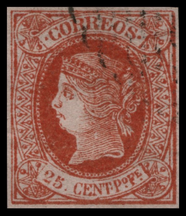
Gooding #24F1 Lithographed on strongly coloured wove paper, rather thinner
than that of the genuine. Most of the stalked pearls in the side-frames touch
either the inner or outer curved lines of the frame. The thin, inner line of
the frame, below the value, is broken and incomplete. The 'T' of 'CENT' has
no bottom stroke. The line which marks the red part of the upper lip is too short,
and does not go to the end of the profile. The stop before 'CORREOS' is a
good deal nearer the 'C' than to the end of the label; and the stop after
'CORREOS' is rather nearer to the 'S' than to the end of the label. (Similar
die as Gooding #21F1, 22F1 and 23F1)
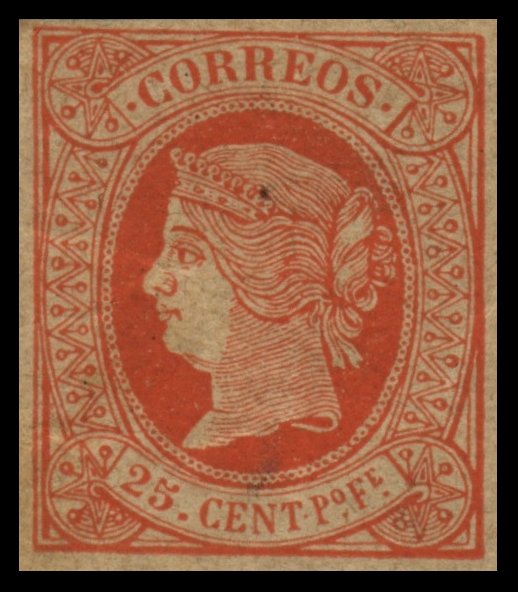
Gooding #24F2 Miguel Segui
Forgery. Typographed on medium yellowish
paper. The second 'R' in 'CORREOS' is larger than the first. The bottom pearl
on the top right corner is lacking shading. The eyebrow is formed by an even
width line. The white curved line at the neckline is cut too wide. There is a
break in second line from the top at the bottom left corner, where it does
not touch the right side of the star. (Similar die as Gooding #21F3 and
#22F2)
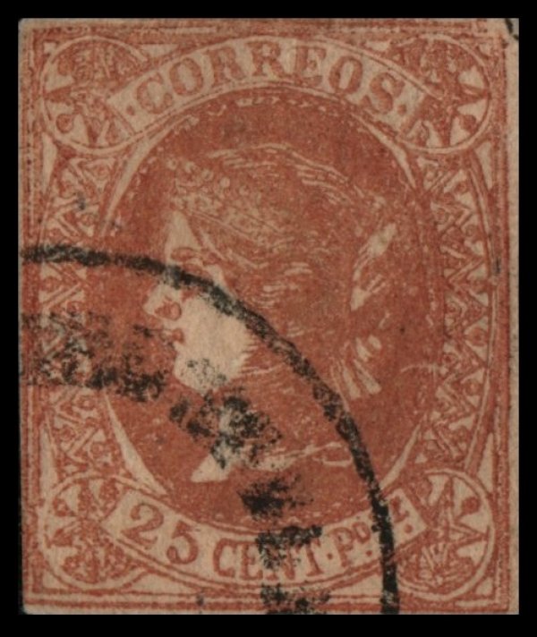
Gooding #24F3 A very crude forgery. Most of the stalked pearls in the
side-frames touch the inner or outer curved lines of the frame. The curved
lines of shading round the star-ornament in top right corner of the stamp is
incomplete and missing a few lines. The eyelid is very narrow, giving the
appearance of a much larger eye than the original The lettering in 'CENT' is
thinner than the genuine, giving appearance of taller letters. The 'o' in '
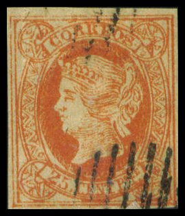
Gooding #24F4 A rather crude forgery. There is no shading in the corner star
ornaments. The pearls around the outer diadem are irregular and do not align against
the genuine issue. The lock of hair is crude. The queen's eye appears to be
closed. There is no period between 'CENT' and 'Po'.
|
![]()
Comments and Feedback Always Welcome .... Please Email
Return to Home Page
![]()