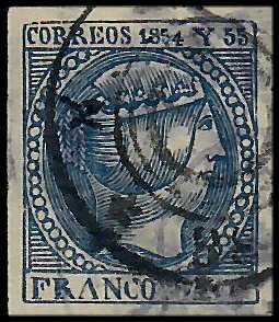
Queen Isabella II
![]()
![]()
![]()
1-Real
|
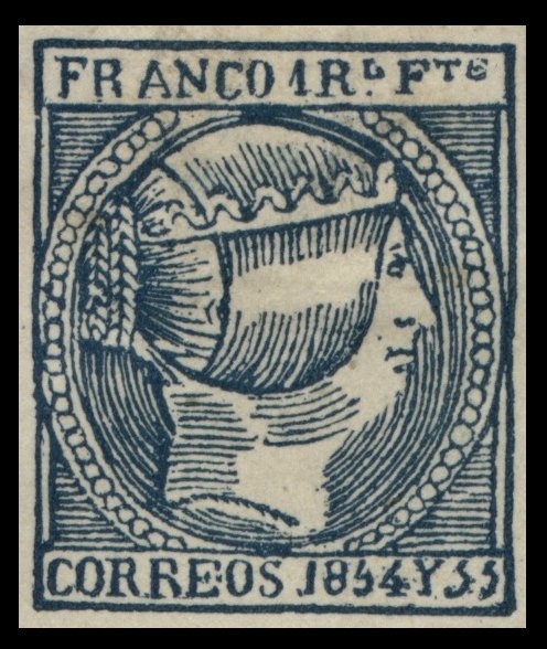
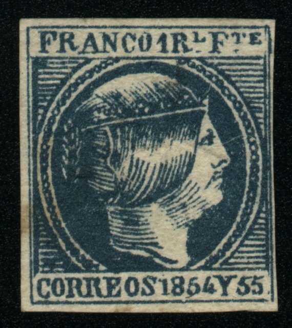
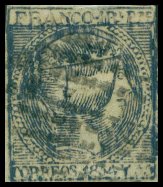
Gooding #4F1 Senf
Brothers Forgery. Issued in dull ultramarine on medium, very white wove paper, with
a very smooth, almost glaze face. Only the '5' of the date has any sign of a
head. There is no stop after 'FRANCO', and none after the 'F' of 'FTE'. The ornaments on the coronet are quite shapeless, so that the
trefoil design cannot be distinguished; and there are no rings in the centers of them. The coils or plaits of hair, at the back
of the head, are extremely faint and indistinct. The 'RE' of 'CORREOS' is
broad and lower than the other letters.
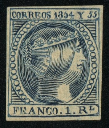
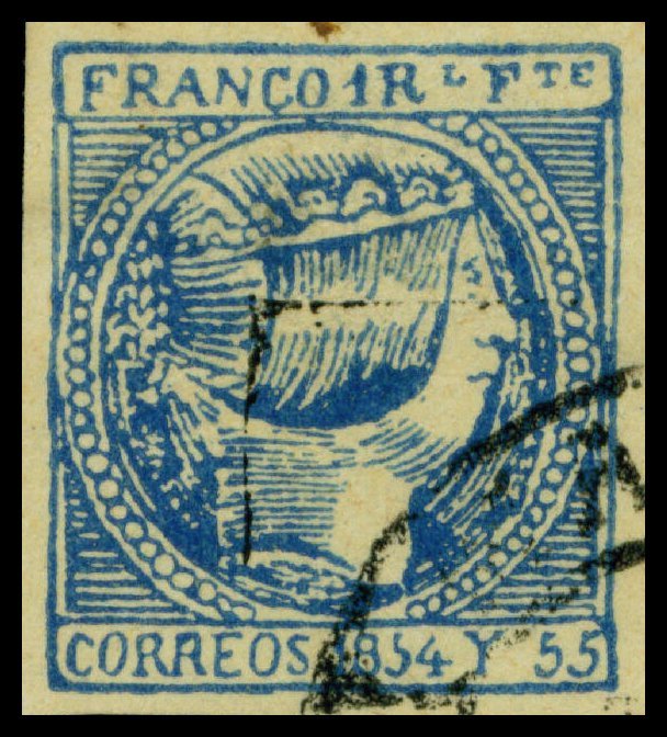
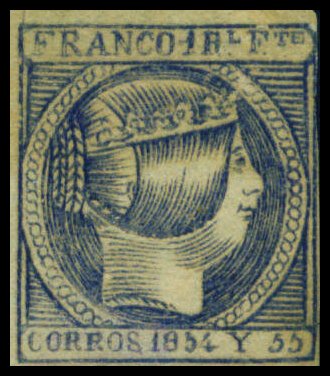
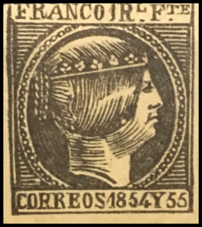
Gooding #4F2 Engelhardt Fohl Forgery. Roughly engraved in Taille-Douce on medium, very yellowish, white to almost
buff wove paper, and issued in a dark greenish blue shade. The inscription
'CORREOS 1854 Y 1855' appears at the top of the stamp instead of the bottom.
Value reads '1 RL' instead of '1RL FTE'. (Same
die as Gooding #1F1, 2F2 and 5F1)
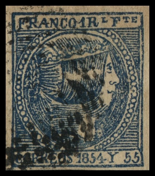
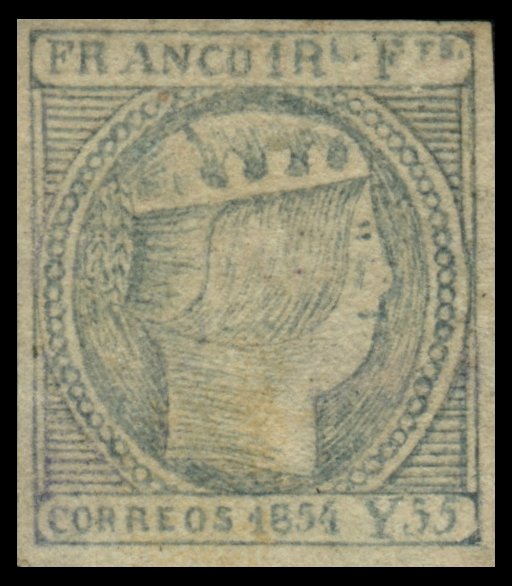
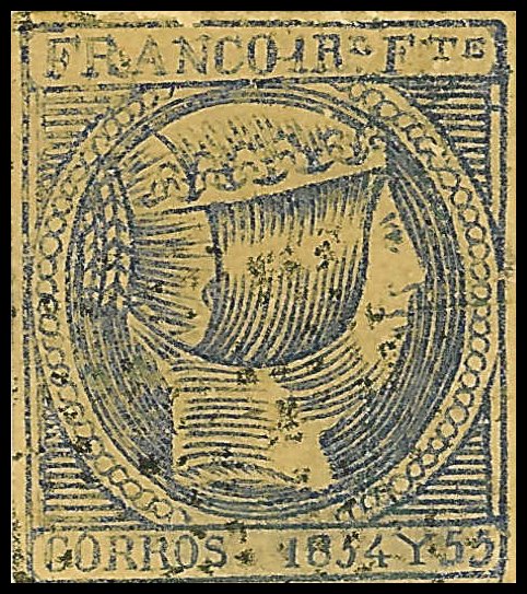
Gooding #4F3 Issued in Blue and
Gooding #4F4 Issued in dark blue on thick paper. Dashes instead of dots after
'R' and 'F' of '1RL FTE'. Circle of pearls are smaller than the genuine stamps and in
some places give the appearance of a thick line. The 'E' of 'CORREOS' is
thick and the bottom line appears to end in a triangle.
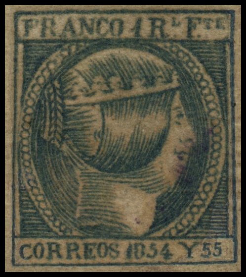
Gooding #4F5 Issued in varying shades of dark blue and ultramarine. 'C' in
'FRANCO' is lower than the other letters. There is no period after 'R' or 'F'
in '1RL FTE'. 'O' in 'CORREOS' slopes to the right. There is virtually no
horizontal line at the top of '5' of '1854'. This forgery exists with the 'Habilitado por la Nacion' Overprint, (Gooding #25F1).
Gooding #4F6 Issued in pale blue. No Period after 'R' and 'F' of '1RL FTE';
however, periods after 'L' and 'E'. The ornaments on the coronet are plain and have no rings in
the centres of them. The Queen's nose is extremely flat and almost aligned
with the chin.
Gooding #4F7 Deceptive
and dangerous forgery issued in blue on yellowish paper. There are too many
horizontal lines around the diadem and are very close together, compared to the
genuine stamps which have them more spaced apart. The 'C' and 'O' of
'CORREOS' are lower than the other letters, with the 'C' dropping further
than the 'O'.
Gooding #4F8 Crude
forgery, circa 1880s, and probably from
Gooding #4F9 CORROS Error Forgery. Stamp
does not plate against the genuine issue. It appears that the original
lettering was erased and altered to imitate the 'CORROS' error, as there is a
light tinge of blue in the area where the erasure was done. The letters in
'CORROS' are too large and there is no space between the 'Y' and '1854' and
'55' on either side.
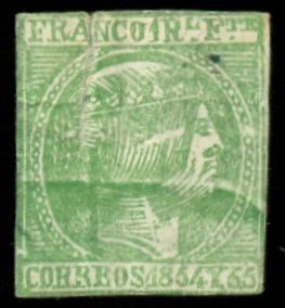
(Provenance: Carl Walske Collection) Gooding #4F10 Crude forgery
issued in Green (colour of 2-Reales issue). All letting is very close
together. The left staff of '1' in '1854' is very
long and almost touches the 'S' of 'CORREOS'. The nostril is very wide and
thick. Only one damaged copy recorded to date.
Gooding #4F11 Forgery
similar to design as Gooding #4F2 in that the inscription 'CORREOS 1854 Y 55'
appears at the top and 'FRANCO 1RL FTE' appears at the bottom (reverse position compared to the
genuine issue). '4' of '1854' is lower than the other numbers. Pearls are
large and lettering is somewhat course. Bogus Circular Cancel.
Gooding #4F12 Somewhat
crude forgery issued in black. The '1' in '1 Rl'
has a broken bottom staff on right. The coronets on the crown are crude and
incomplete. The 'S' of 'CORREOS' is irregular with almost horizontal top and
bottom curves. The '55' of '1855' are narrow and the second number is very
thin. Only one example recorded to date.
|
![]()
Comments and Feedback Always Welcome .... Please Email
Return to Home Page
![]()