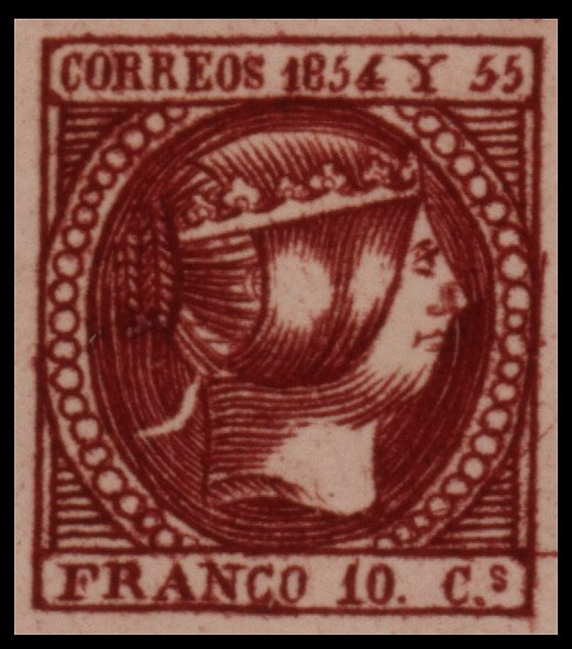
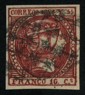
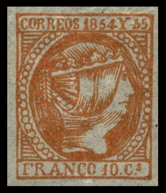
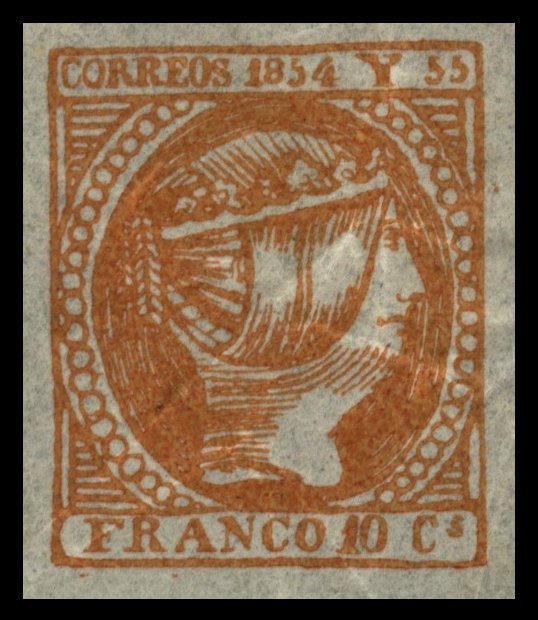
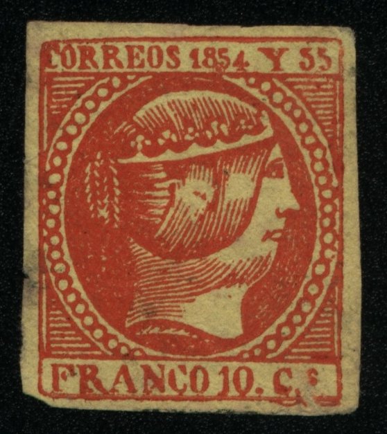
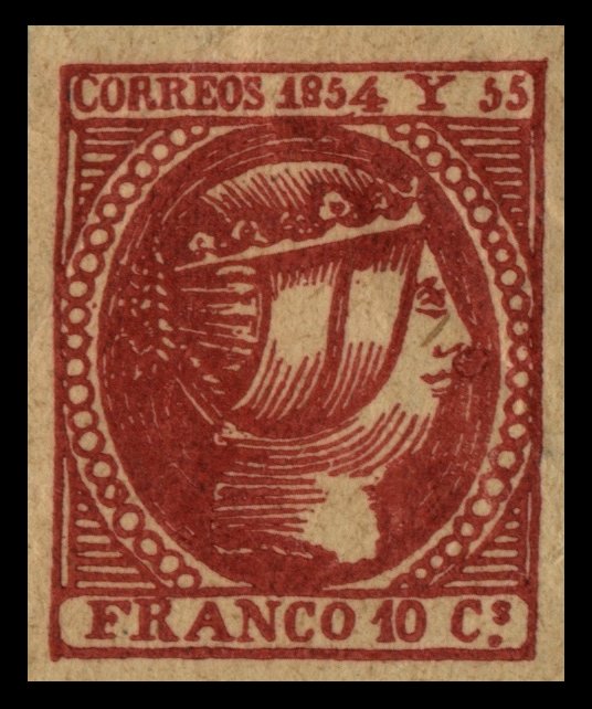
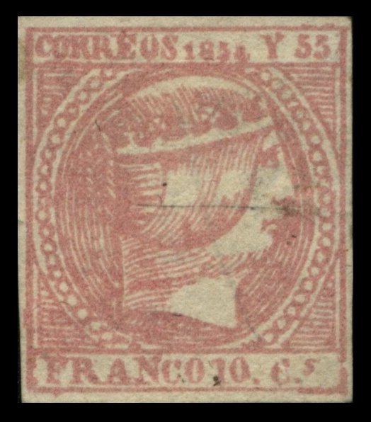
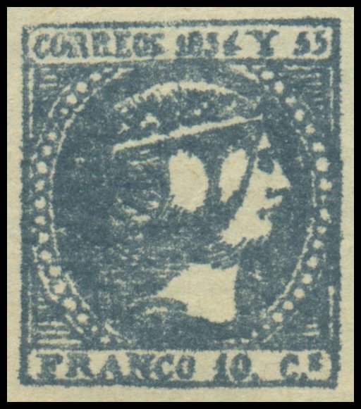
Queen Isabella II
![]()
![]()
![]()
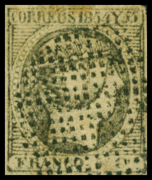
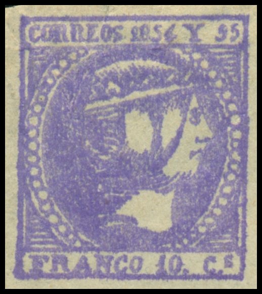
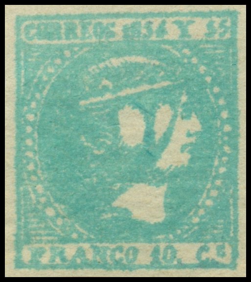
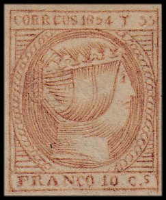
10-Cuartos Black
|
Gooding #2UF1 Crude forgery in black not of any distinguishable type in the
sheet of forty. Letters and numbers on top label are even and large.
Virtually no space between the 'Y' and '1854' and '55'. The value '10'
between 'FRANCO' and 'Cs' does not appear to exist. There are no coronets on
the crown, which is formed by two diagonal lines, the top one slightly wavy.
Known used with circle of dots cancellation.
|
||
|
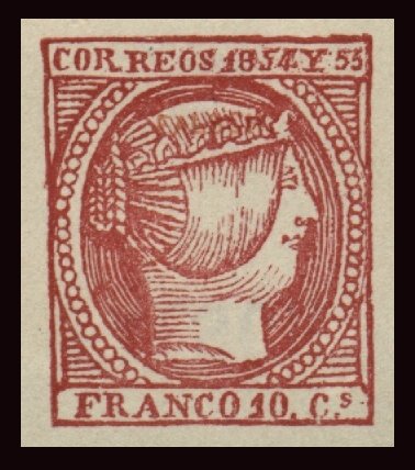
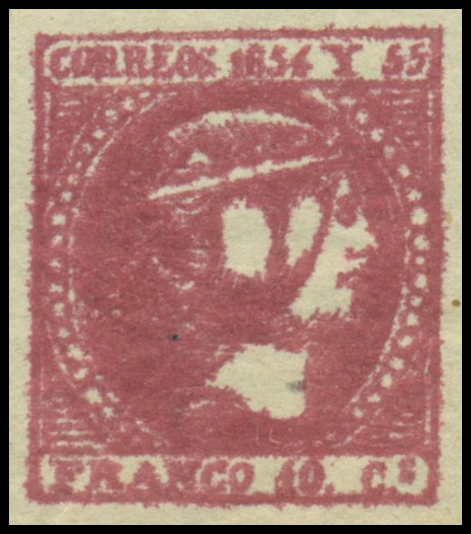
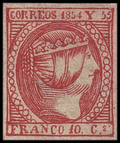
10-Cuartos Rose and Carmine Gooding #2F1 Senf
Brothers Forgery. Lithographed in dark rose on modern white paper. The 'RE' of
'CORREOS' is broad and lower than the other letters. A great exaggeration.
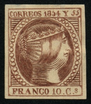
Gooding #2F2 Engelhardt Fohl Forgery. Roughly engraved on thick, very
hard buff wove paper. The coils of the hair are so shaded as to appear like
two wide double plaits, instead of four narrow single ones. There are only
seven horizontal lines in the three of the spandrels, and six in the one in
the left lower corner. The period after the '10' is a little nearer the 'C'
than to the '10'. The 'C' of 'FRANCO' has a thick end to its tail, which
resembles a 'G' The colour is pale carmine, unlike the pale red of some of
the genuine issues. (Same die as Gooding #1F1, #4F2 and #5F1)
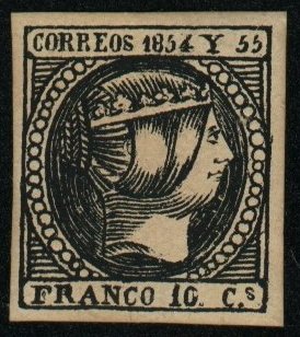
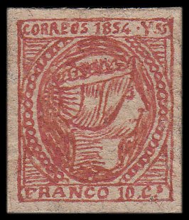
Gooding #2F3 Jean de Sperati
Forgery. The sheet position copied is the thirty-third stamp (third
stamp in the seventh row). The central stroke of the 'F' in 'FRANCO' is very
weak and is represented by little more than a dot and the 'R' is taller than
the other letters. There is a white dot in the right side of the '0' in '10'.
The frame line half way up on the right is extended. Die Proofs are known in
black and in colour, as well as unused and used reproductions in carmine. The
forgery also exists in black. Some copies are known with a 'Sperati Reproduction' handstamp on the reverse. Gooding #2F3A
Gooding #2F3B
Gooding #2F4 Issued in shades of carmine and orange and printed on thin
paper. The horizontal line of '5' in '1854' is very short, as with the first
'5' in '55'. The middle horizontal line in 'F' of 'FRANCO' is broken,
appearing as a dot instead of a joined line.
Gooding #2F5 Issued in orange and printed on thin paper. The 'Y' is thick and
the top lines slope giving the appearance of a 'U'. The '1' in '10 Cs' is
thick and slopes to the right and almost touches the '0'. There are no
periods after '10' and 'C'.
Gooding #2F6 Issued in red and printed on thick yellowish paper. The 'C' of
'CORREOS' touches the borders on the left and top frame line. The '4' of
'1854' is lower than the other numbers. The second horizontal line in 'F' of
'FRANCO' is broken, appearing as a dot instead of a line. Similarly, there is
a break in the top loop of the 'C' of 'FRANCO'.
Gooding #2F7 Issued in carmine on thick yellowish paper. The '4' of '1854' is
larger than the other numerals. There is no period after '10' of '10 Cs'.
Gooding #2F8 Lithographed in pale rose, much the colour of the genuine. The
figures '185' of the date are all barely half of the height of 'CORREOS Y',
and the '4' is still smaller; so that the whole date seems to be sloping down
to the right, instead of level. The 'S' of 'Cs' is like a '5' and a
considerable distance from the 'C'. The trefoil-ornaments on the coronet are
very small, and only two of them show the ring in the centre. The coils of
hair at the back of the head are extremely faint and indistinct; there
appears to be three of them (Same die as Gooding #1F6).
Gooding #2F9 Very crude forgeries. Issued on very thin paper in varying
shades of Black, Violet, Blue-Green and Red. Heavy inking with some stamps
showing signs of 'bleeding', most evident around the frame lines. The 'S' of
'CORREOS' just touches the 'O'. The neck comprises of very thick blotches
instead of fine lines as in the genuine stamps.
Gooding #2F10 Hand-drawn Facsimile. Crude overall appearance with letters,
numbers and Queens effigy significantly different from the genuine issues.
Stated to be one of around 250 indicidually
unique hand-drawn stamps discovered in a cream-coloured stockbook
belonging to a Walter D Young discovered in an old desk by a Cabinet Maker in
Woking, Surrey, UK around July 1951. Artist remains unknown but evidently
spent a great deal of time on his work.
Gooding #2F11 Printed in red-orange shade. The 'E' in 'CORREOS' is missing the
middle horizontal line appearing line a 'C'. The circle of pearls is small
and gives appearance of it slanting downward. The 'N' in 'FRANCO' is far away
from the 'A'; and the letters 'C' and 'O' are very close to each other.
Gooding #2F12 Somewhat crude forgery. Large sized pears. Small break on the
right corner of the top frame line. The 'R' in 'FRANCO' tilts and leans left
and the 'O' is narrow and thin, more on the right side. Letters in 'FRANCO'
are not aligned on the bottom. Small period to the right of
's' in 'Cs'.
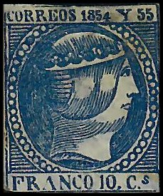
Gooding #2F13 Printed in blue in comparison to the genuine issue printing in
rose or carmine. The '4' in '1854' is much smaller in comparison to the other
numbers. Large lettering on bottom tablet. The 's' in 'Cs' is slanted.
|
![]()
Comments and Feedback Always Welcome .... Please Email
Return to Home Page
![]()