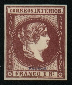
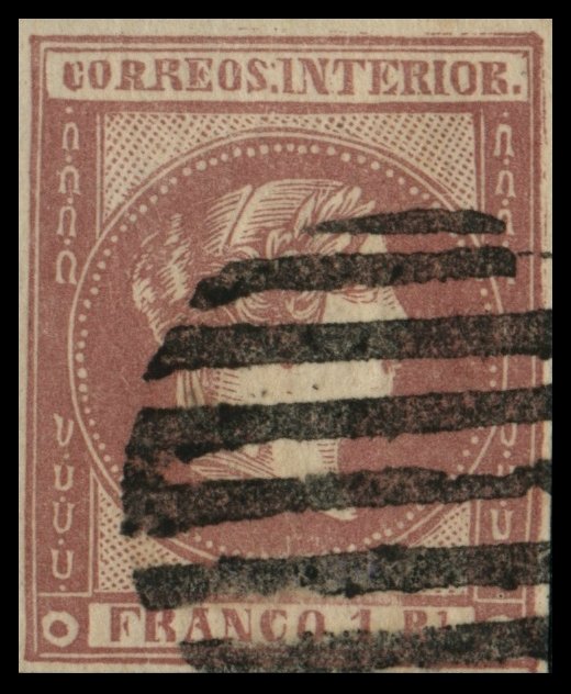
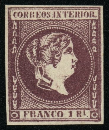
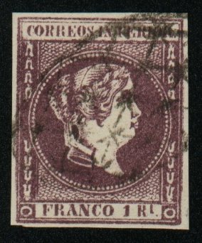
Queen Isabella II
![]()
![]()
![]()
January 1863
1-Real
|
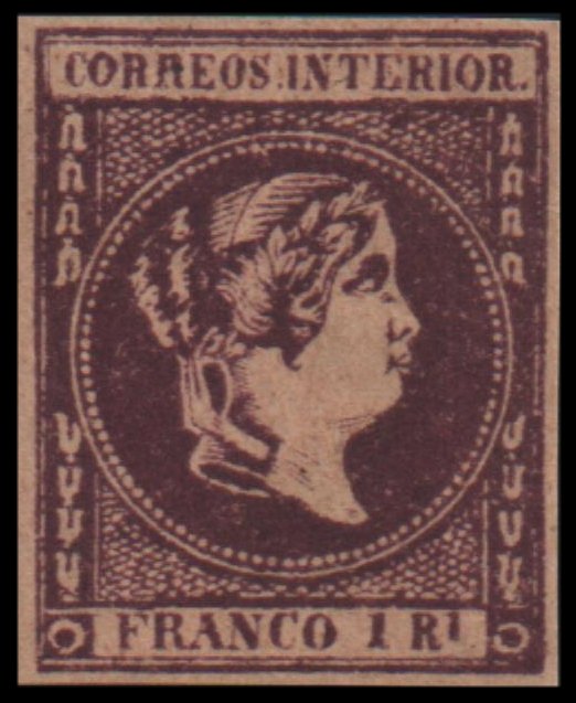
Gooding #16F1 The 'C' of 'CORREOS' is too near to the left frame and too tall
and the second 'R' is too large. The second 'R' of 'INTERIOR' is too wide at the
bottom. The circle almost touches the line at the top and bottom, with only
one row of the fish-scale network above the top of the central circle and two
below the bottom of it. There are nine-two pearls round the central circle,
and they are all distinctly separate from each other, except two near the
chignon; whereas in the genuine, some of them run together. The Queen's lip
is pointed somewhat upwards. The bust is too much pointed. Known unused or
cancelled. (Similar plate to Gooding #14F3, #15F1 and #17F1). No picture available Gooding #16F2 Senf
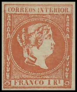
Brothers Forgery. Believed to be of German origin. Typographed
on stout, extremely wove paper. The letters of
'CORREOS' get larger from 'C' to the end, so that the 'S' almost twice as
large as the 'C'. This is a great exaggeration of the genuine. The letters
'NT' of 'INTERIOR' are considerably larger than the rest. There is no period
after 'RL'. Some stamps exist
with the word 'FALSCH' printed in blue just above the lower label. Known to
exist unused and used with parallel bars in an oval.
Gooding #16F3 Jean de Sperati
forgery. The shading on the nose, under the chin and on the neck, have lost a certain amount of detail and cover a smaller area
than they do in the genuine. There are a number of major flaws in the top
inscription. The upright of the second 'R' in 'CORREOS' is broken away from
the loop and the tail. The head of the 'S' is broken, there are two white
spots, one in the belly and one in the lower serif and there are two
indentations under the diagonal stroke. The upper right serif is broken off
the 'T' in 'INTERIOR' and the bottom left serif is cut away. The second 'I'
is cut away and there is a break at
Gooding #16F4 Dangerous forgery in purpose and also printed in shades of
orange. First 'O' in 'CORREOS' is broken on the bottom right corner. Circle
on bottom left broken on bottom left corner. Circle on bottom right has a
crack in the middle on the left side. Thick eyebrow not showing the line
details as on the original stamp. Shading around the central bust is crude
and appears more condensed.
|
![]()
Comments and Feedback Always Welcome .... Please Email
Return to Home Page
![]()