Queen Isabella II
![]()
![]()
![]()
1855
5-Cuartos Cabeza Chica (Small Head)
|
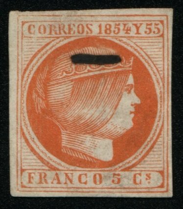
Gooding #7F1 Senf Brothers
Forgery. Printed in Leipzig in about 1887 and issued in a dull red or
orange shade. The word 'FALSCH' appears in black across the top of the head.
It is also known cancelled over the word 'FALSCH'. The 'C' in 'CORREOS' is
higher up and does not touch the bottom frame line. The horizontal line in
'4' of '1854' points up at the end. The 'C' in 'FRANCO' is very rounded and
almost resembles an 'O'. The bottom curve of 'C' in 'Cs' is very rounded,
giving the appearance of a 'G'.
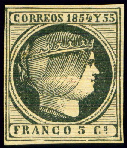
Gooding #7F1A Same type as Gooding #7F1 but printed in black, without the word
'FALSCH'. The impressions, frame lines and shading appear thicker and rougher
than the issued stamps, with the shading line on the neck extending much
further to the right. It is probable, although not certain, that this was a
trial-print produced in black by the Senf Brothers
prior to the issued forgery (#7F1) being printed. This was known practice
with forgers of the time, with other black printed trials known on stamps
created by Sperati and others.
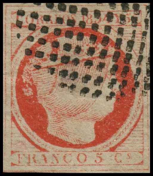
Gooding #7F2 A very deceptive forgery printed in vermilion, very similar to
the actual issued stamp. The 'C' in 'CORREOS' is higher up and does not touch
the bottom frame line. The 'O' in 'FRANCO' is thin and much more rounded than
the genuine issue. The curve in the top line in '5' is larger. A very
deceptive forgery has a much larger loop in the in 'CORREOS'.
|
![]()
Comments and Feedback Always Welcome .... Please Email
Return to Home Page
![]()